COROS AI · Case Study
Designing an AI that remembers you
A page that reflects a user's coaching history back to them at an early-stage AI startup, designed end to end from the information architecture to the prompts behind every card.
- Role
- Product Designer · Prompt engineering · Prototyping · Co-implementation
- Team
- Founder/CEO · 2 engineers · 2 designers
- Timeline
- April 2026 – Present
- Tools
- Figma · Claude Code · Streamlit · HTML/CSS/JS · Prompt engineering
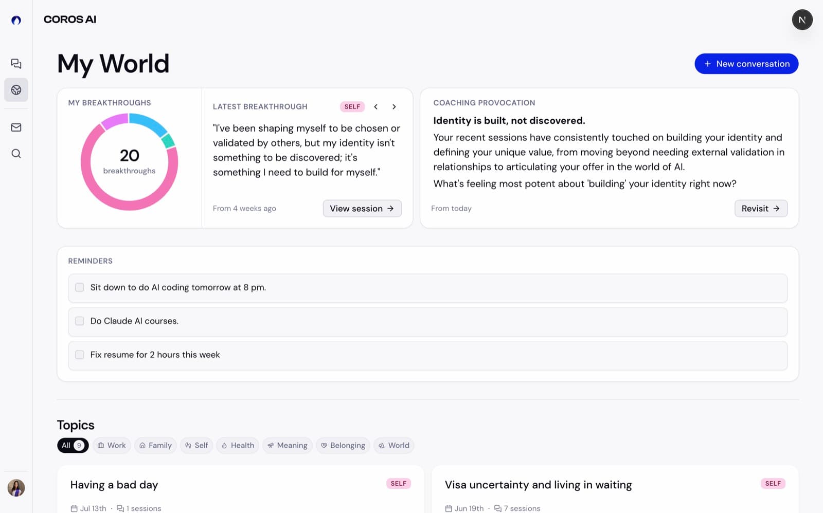
My World, at a glance
The problem
Coaching that evaporates
COROS is an AI life coach. Users have genuinely transformative conversations: they name a fear, make a commitment, see something about themselves for the first time. Then the session ends and all of it vanishes into chat history.
My World reflects that history back. The brief I wrote for it became the team’s north star:
A mirror, not a filing cabinet.
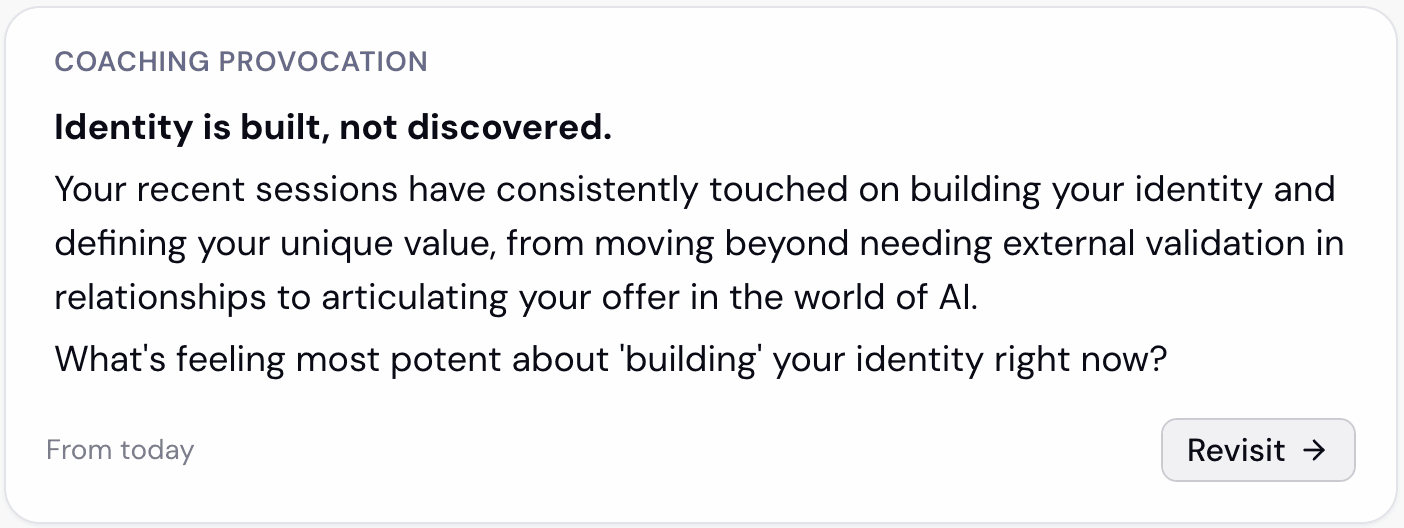
Not a tracker, not a stats dashboard, but a surface that shows you the pattern of your own transformation and invites you back into conversation. That one sentence settled dozens of downstream debates: no page-level filters, no scores or streaks, a ~100-word cap per widget, and every element ending in an on-ramp back to coaching.
And this wasn’t UI over an API. Every card’s content is generated by LLM prompts I wrote, so I owned three layers at once:
- The information architecture: how raw conversations become structured, browsable objects.
- The interface: a responsive page of independent widgets.
- The prompts, plus the QA tooling: the generation layer behind every field on screen, and the harness that validates it.
Layer 1 · Architecture
How the AI organizes what it remembers
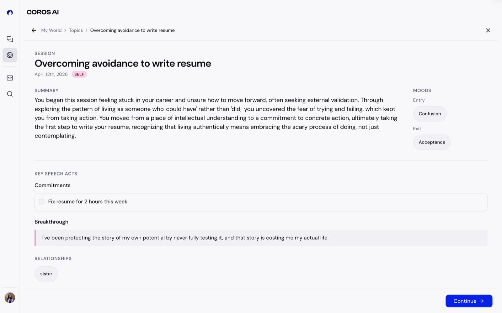
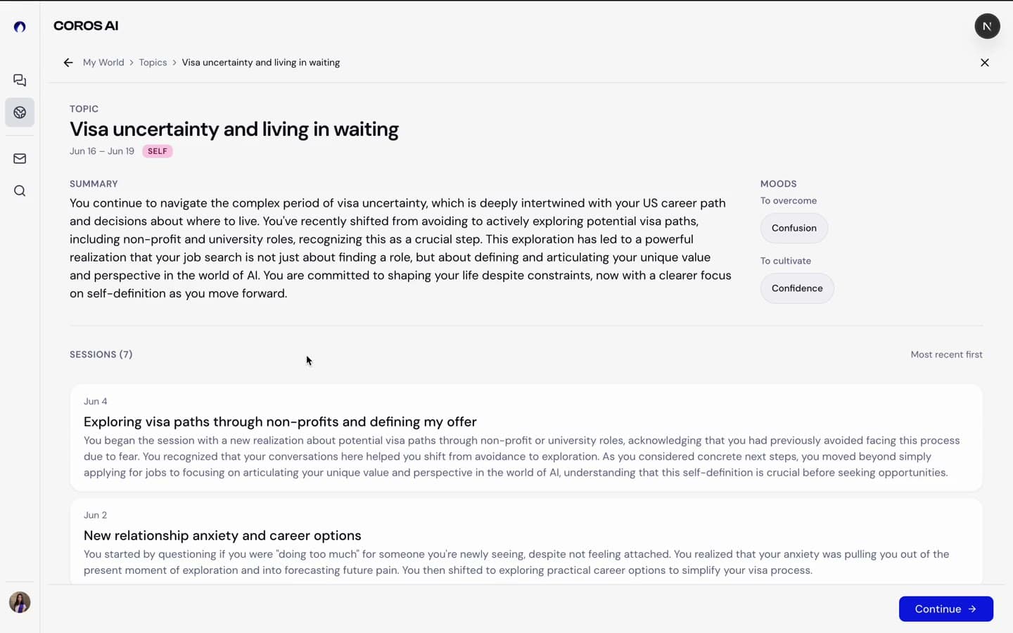
I co-authored the product’s design and implementation document through four versions, which engineering builds from directly. Its core distinction: a Session is an event: one conversation, factually summarized into a structured object with summary, moods, breakthrough, reminders, and relationships. A Topic is a territory: a situation the user keeps returning to, like “Navigating a difficult conversation with dad.”
The rule I fought hardest for: a topic is a situational territory, never a feeling. Early model outputs kept producing topics like “Self-worth”, which is navigationally useless and subtly harmful. I codified this as the identity-vs-texture rule: feelings may color a summary, but never become the title. It now governs the topic prompts and the two-stage detection pipeline (embedding search feeding an LLM match decision).
I also framed My World as a federated portal: each widget ships independently with its own prompt, logic, and documented rationale, so engineers could build one widget without waiting on another to stabilize.
Layer 2 · Interface
Three iterations that mattered
The main view
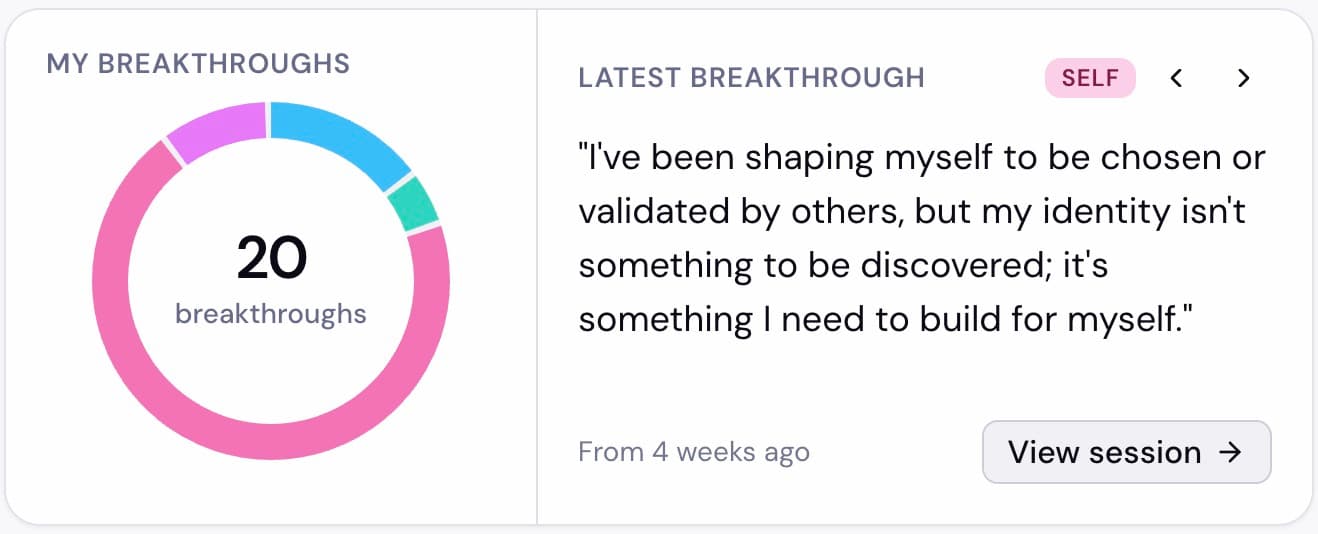
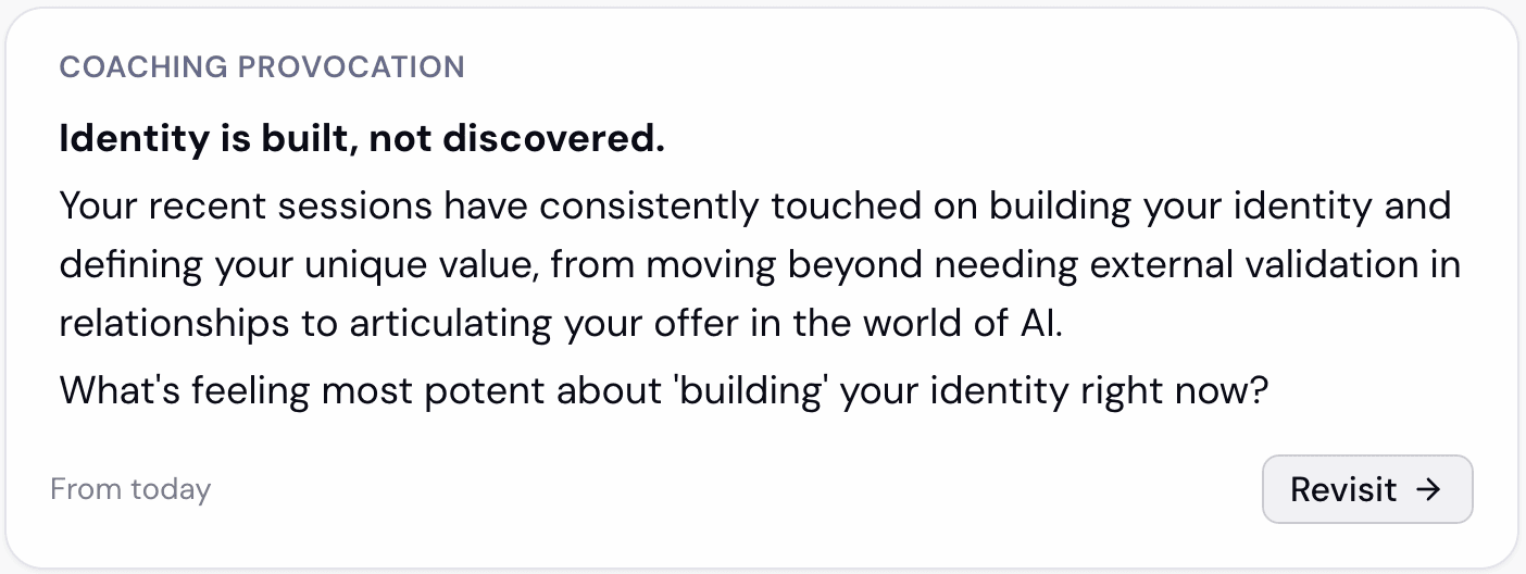
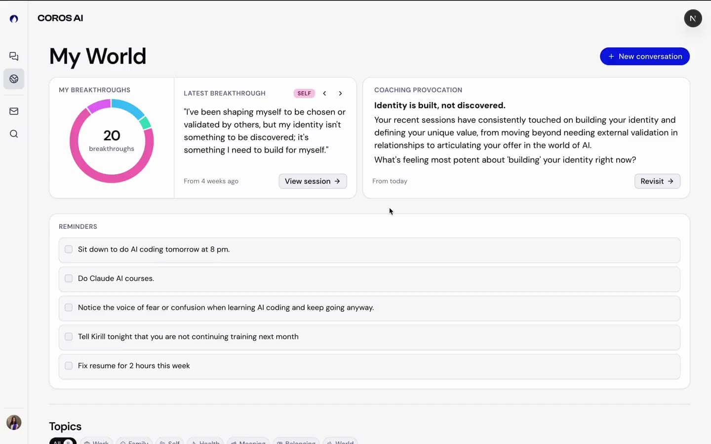
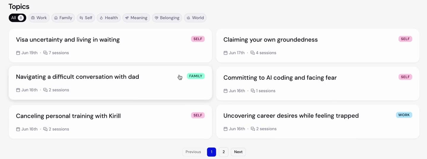
A featured band of three reflective cards (My Breakthroughs, Coaching Provocation, Latest Breakthrough) above a full-width stacked Topics list, filterable by seven life dimensions (Family, Work, Self, Health, Meaning, Belonging, World) and by status. Topics are never tiled as a grid; each gets room to breathe. A cross-page filtering concept tested well, but I argued to defer it and hold a stricter rule: filters belong to individual widgets, not the page.
Combining two key widgets
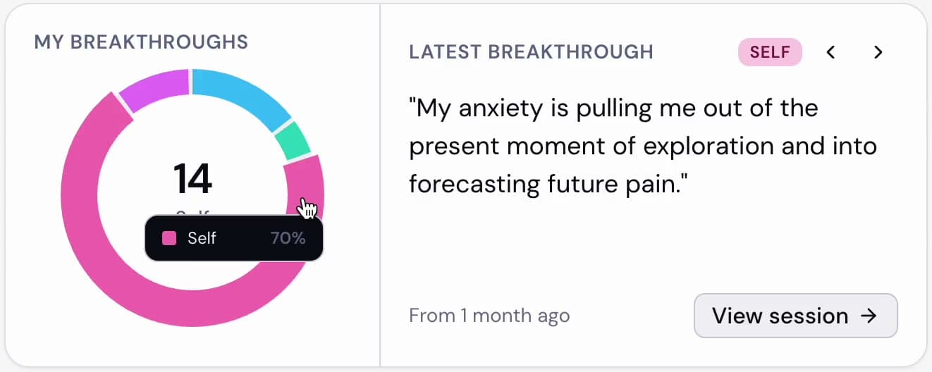
We had two separate widgets, and the donut was under threat from a line-chart alternative. Instead of choosing, I merged them into one widget with two modes and specced the full state machine:
- Mode A: donut inert, the panel shows the newest breakthrough, arrows walk the whole history.
- Mode B: clicking a segment filters the panel to that dimension, and auto-advancing past a dimension’s last breakthrough moves the donut’s live selection in real time, traversing dimensions in palette order.
I resolved every edge case before handoff: backward symmetry, wrap behavior, and empty dimensions absent from the ring and the traversal alike. The merge settled the chart debate and delivered cross-filtering as an intra-widget interaction, honoring the no-page-level-filters rule.
The Reminders widget
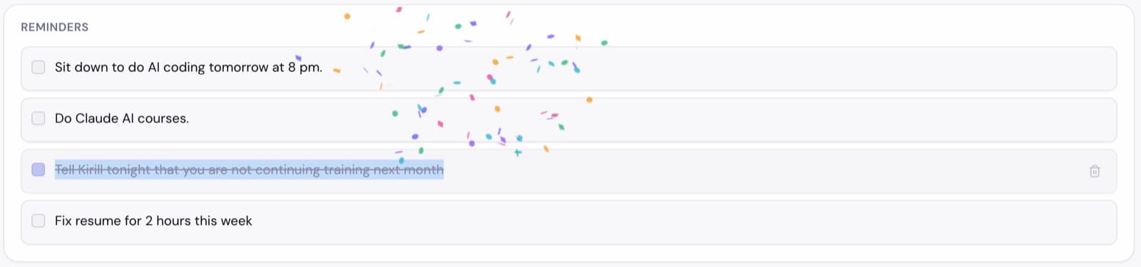
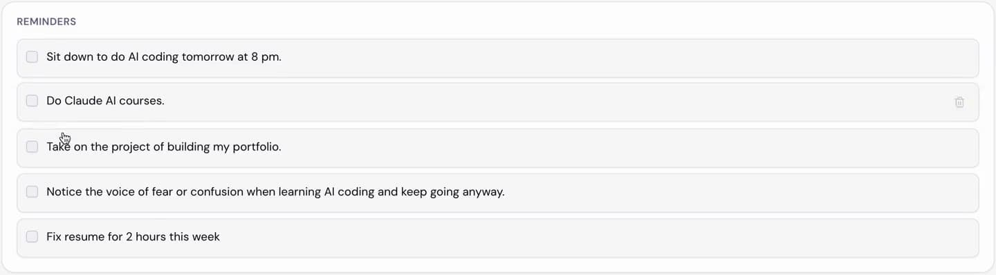
When the team reframed commitments into reminders (which can also be stances: “Notice the voice of fear and keep going anyway”), I designed the widget that carries them: reminders pooled across all sessions, newest first, paginated inside the widget. Two actions, Done and Delete. Delete exists because these are AI-generated and can be wrong, so users need an honest way out. Both update shared state across the widget and the originating session.
One detail I’m proud of: an unchecked reminder re-enters at its original chronological position, so position always encodes creation order. I flagged the engineering implication myself: the creation timestamp must live in shared state, not be derived from visible position, and it went straight into the build spec.
Simplifying a cluttered screen
Alongside these, I ran repeated decluttering passes on the topic card and detail views in weekly triage with the founder: labels stripped to inline values, “Archive” renamed to “Box” to fit the product’s language, sticky bottom CTAs held because users decide to continue only after reading. The whole design is responsive, specced with breakpoint behavior across desktop and mobile rather than as two designs.
Layer 3 · The AI
Prompts, testing, and QA
Prompt engineering as design work
I wrote and iterated the prompts that generate everything on screen: the session summary (six versions, now the canonical data artifact), the topic summary (seven versions), topic detection, and the coaching invitation prompt now in progress. The craft is closer to spec-writing than copywriting. Silence in a gate is an admission: if you don’t explicitly name an exclusion with examples, the model walks through it.
The breakthrough field shows the stakes. A breakthrough shown back to a user is a claim about their life; get it wrong and you manufacture a false memory. I built it around a strict ownership gate (it can only reflect what the user actually said or agreed to), explicit guardrails against language that overstates or fictionalizes change, and a required register that describes rather than diagnoses.
Building my own testing tools
To validate all of this, with the development team, I built out our Streamlit playground: a QA harness that runs real conversation transcripts through the entire My World pipeline (session summary, two-stage topic detection, and topic summary), exporting structured JSON. I later added an Invitation tab for the provocation prompt with a five-line additive diff.
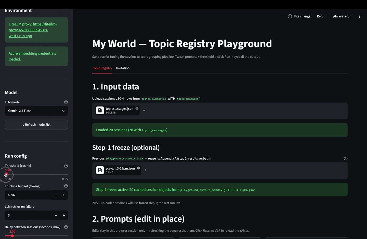
My method: run a batch of ~20 sessions, then check every output field against the prompt’s own rules. A recent run surfaced five must-fix issues: each traced to a specific missing clause and fixed with a surgical insert, not a rewrite.
Co-implementation
From mockups to shipped code
Midway through, I stopped ending my work at the Figma handoff. Using Claude Code, I began implementing widgets on localhost and shipping working builds to engineers for review.
The technique that made it work: I write implementation prompts the way I write design specs. The combined breakthrough widget went to code as a complete state machine, with every assumption flagged as a one-line toggle if wrong. Engineers now review a working reference instead of interpreting a static frame.
Status
Where it stands
My World is live in development: the featured band, Reminders widget, and topic surfaces are implemented; the invitation prompt and mood taxonomy integration are in progress.
Reflection
What I'd want a hiring team to know
The takeaway I’d offer a hiring team is the shape of the work: I wrote the product doc engineers build from, the prompts that generate the content, the QA tooling that validates them, and increasingly the code itself.
At a pre-seed startup, the most valuable designer is the one who removes handoffs. That’s the designer I’ve become, and the design engineer I’m becoming.