COROS AI · Case Study
Designing an AI that remembers you
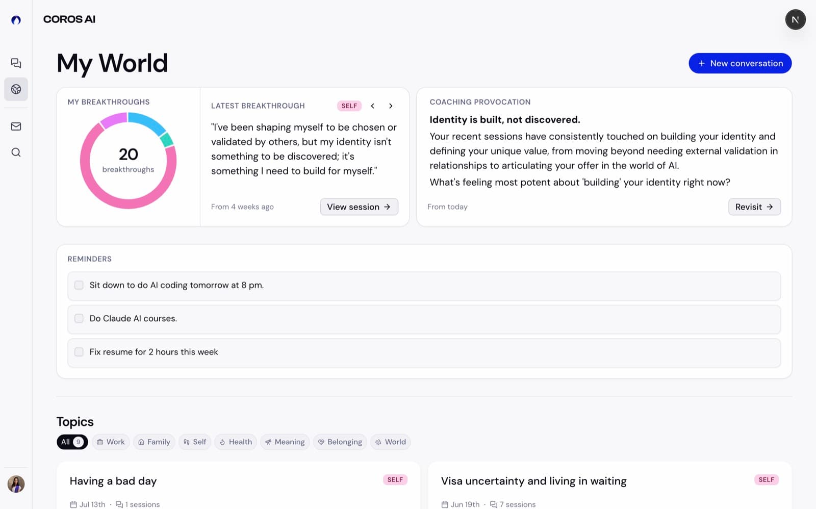
“My World” is an experience that remembers your coaching conversations with COROS AI, showing your breakthroughs, reminders, and ongoing concerns at a glance. I designed it end to end: architecture, interface, and the AI prompts that write every card.
- Role
- Product Designer · Prompt engineering · Co-implementation
- Team
- Founder/CEO · 2 engineers · 2 designers
- Timeline
- April 2026 – August 2026 (in progress, shipping incrementally)
- Tools
- Figma · Claude Code · Streamlit · TypeScript, React on Next.js
The product
COROS AI: an AI life coach that helps you navigate relationships and communication.
It is a B2C AI-native coaching platform with a chat-based interface, where people have long, ongoing conversations by text and voice. I joined as the founding product designer, and my work has spanned product design, UX, prompt engineering, user research, and brand.
The problem
How we got here
25 customer interviews. One thread ran through nearly all of them: the coaching lands, but the product never shows it.
“I had a difficult relationship with one of my nephews. From COROS, I had breakthroughs there. I can’t find them anymore.”
“If I could separate work and relationship conversations into different threads, that would be really useful.”
The ask wasn’t better coaching. It was somewhere to see the coaching they’d already done.
So I gave the conversation structure:
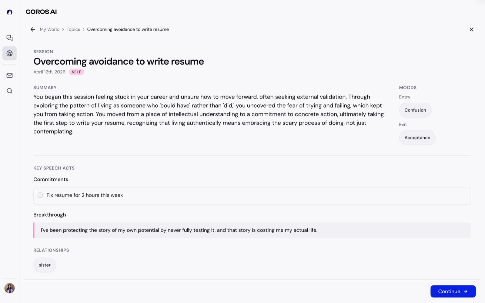
- Session: one bounded conversation about one situation.
- Topic: the recurring situation that many sessions belong to.
- My World: where your topics, breakthroughs, provocations, and open commitments live.
Architecture
How the AI organizes memory
A Session is an event. A Topic is a territory the user keeps returning to.
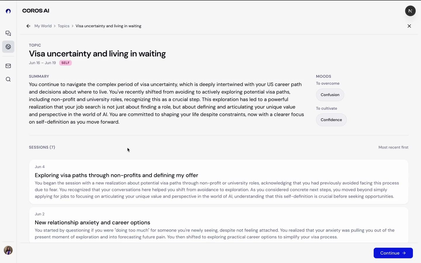
The rule I fought for: a topic is a situation, never a feeling. “Conversation with dad,” not “Self-worth.” It now governs the detection pipeline.
The interface
The interface
The page
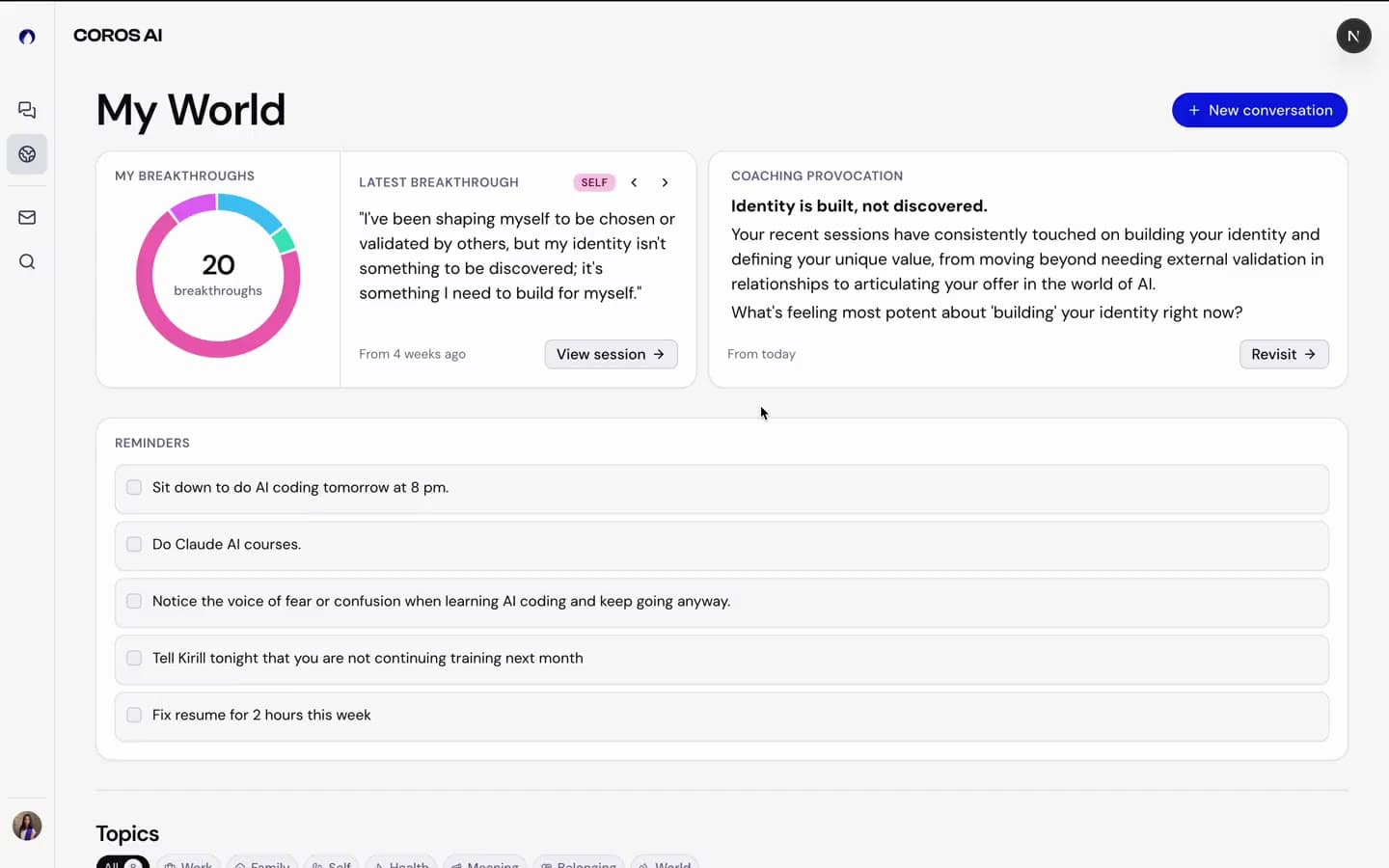
Two widgets became one
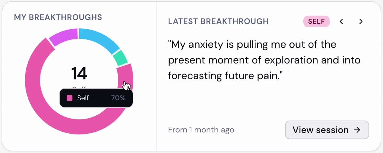
The breakthrough donut was about to be cut. Instead of defending it, I merged it with the Latest Breakthrough card and specced the full state machine.
- Every edge case resolved before handoff: wrap, backward symmetry, empty dimensions.
- Settled a team debate and delivered cross-filtering without breaking the no-page-filters rule.
Reminders
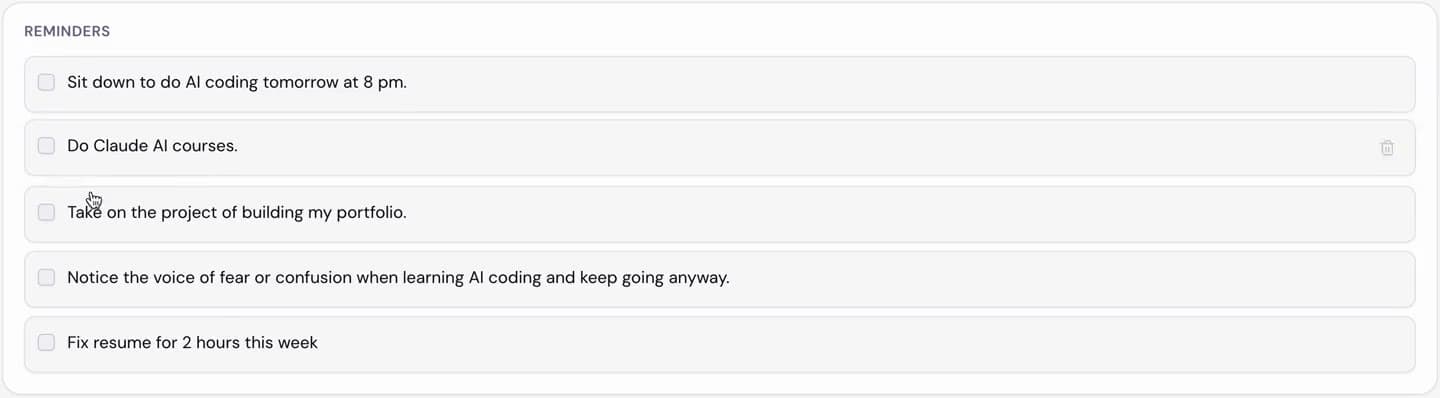
- Unchecking re-inserts at original chronological position.
- I flagged the engineering implication (timestamp in shared state) in the spec myself.
Decluttering
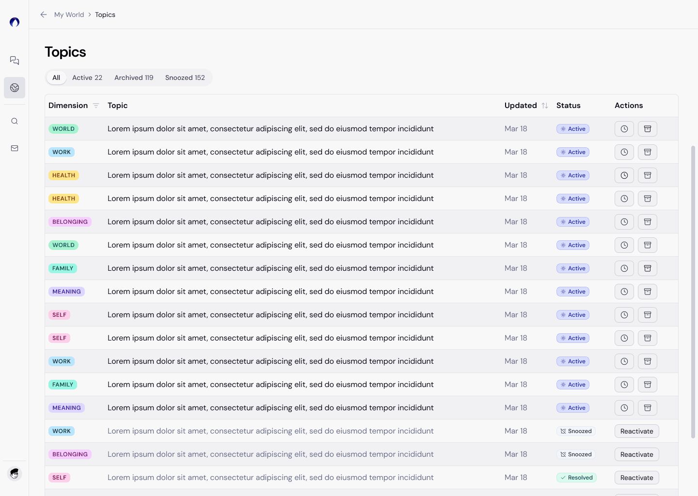
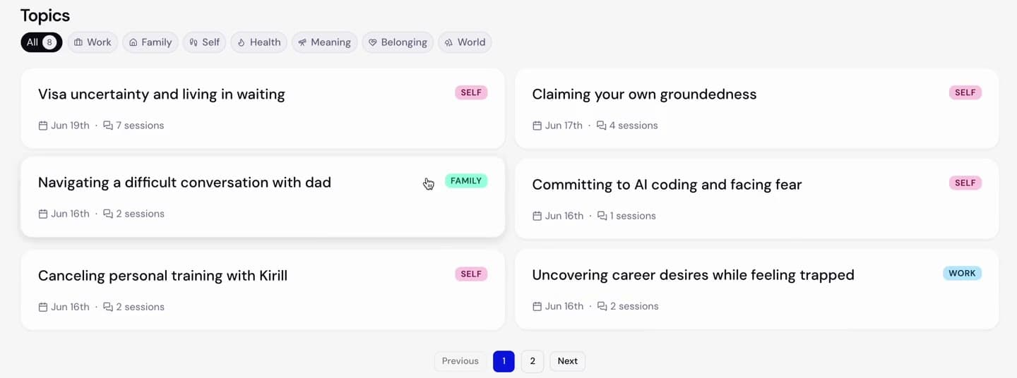
From a data table to a bento box. Every topic became a widget you could scan, not a row you had to read.
Initial designs featured topics like a CRM
I pitched against it to stakeholders, and landed on a widget-style bento box design for the entire page, including topics, introducing more ways of visualizing data rather than just a topics list.
The AI
The prompts are the product
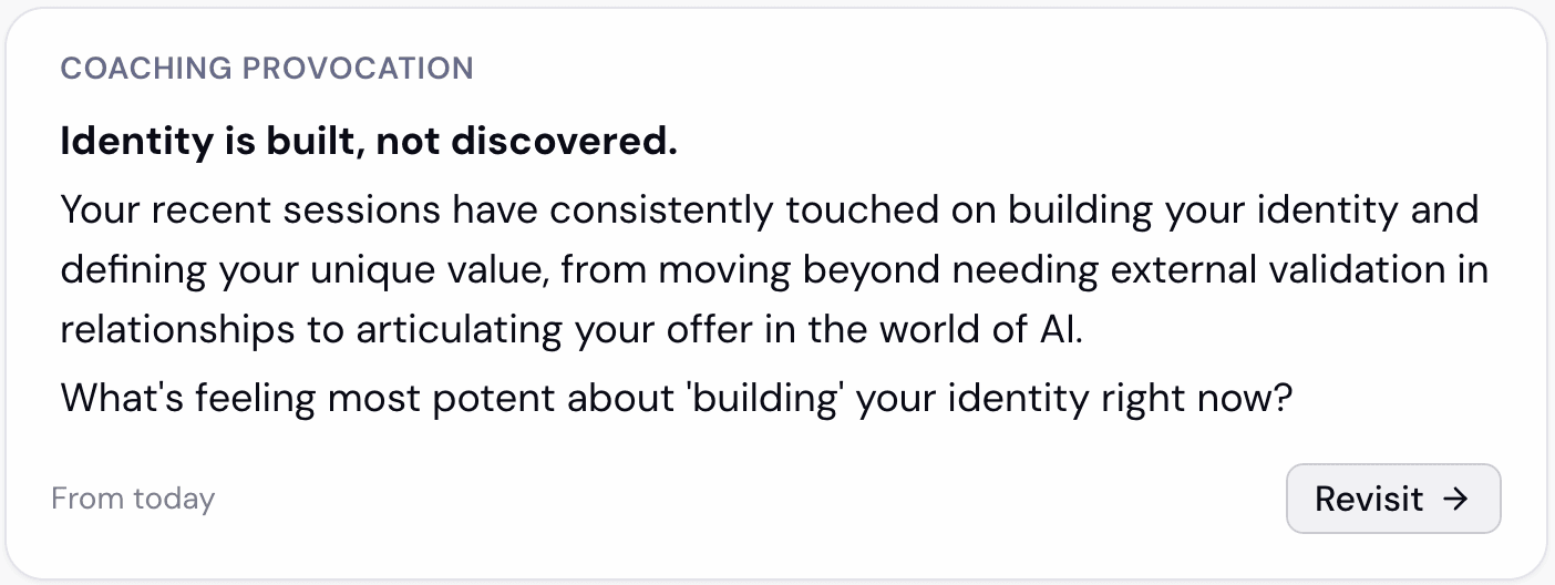
Every card’s content is LLM-generated from prompts I wrote: session summary (v6), topic summary (v7), topic detection, coaching invitation.
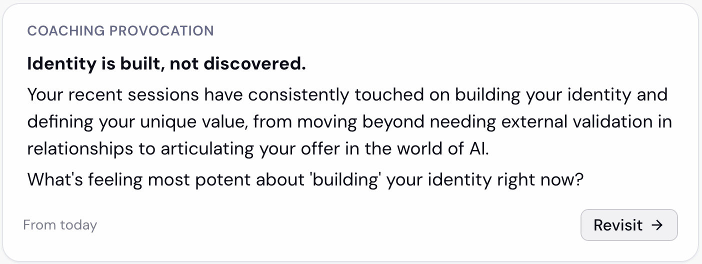
The stakes: a wrong “breakthrough” manufactures a false memory. So the prompt has an ownership gate: it can only reflect what the user actually said or agreed to.
And I test them myself
- Method: 20-session batches, every field checked against the prompt’s own rules.
- One run surfaced 5 must-fix issues. Each fixed with a surgical clause, not a rewrite.
Transcript review
Finding where the conversation broke
I run the same 20 real session transcripts through every prompt and score each generated field against the rule it’s supposed to follow. I read a stratified sample by hand to confirm the scores, fix the rule that let a failure through, and re-run the same batch to check the fix held. A wrong breakthrough manufactures a false memory, so an inaccurate card is a trust failure, not a cosmetic one.
20-session batch in
Score every field (semantic + LLM judge)
Read a stratified sample
Fix the prompt
Re-run the same 20 sessions
- One run surfaced five must-fix issues, each traced to a specific rule the output had violated.
- Every fix was a single added clause rather than a prompt rewrite, so each change stayed attributable to one behavior.
- Fixes were verified by re-running the same 20-session batch, not by checking one output.
User conversations are confidential, so the examples on this page are redacted or synthetic. The prompts themselves are company IP.
Co-implementation
From mockups to shipped code
I implemented production grade front-end in TypeScript and React on Next.js.
Reflection
The takeaway
I wrote the doc engineers build from, the prompts that generate the content, the QA tooling that validates them, and increasingly the code itself.
At a pre-seed startup, the most valuable designer is the one who removes handoffs.